Q&A: Roby Isaac and Samantha Fletcher
When we search through options for a project or when we see a stunning floor, we don’t always appreciate all the steps it takes to get from concept to completion.
One of the most interesting parts of the process is design. Mannington Commercial designers take a unique approach that involves deriving inspiration from myriad areas outside our industry. We’re talking with Mannington Commercial’s Vice President of Commercial Design Roby Isaac and Creative Manager Samantha Fletcher about how their team takes an experience and translates it to a product design.
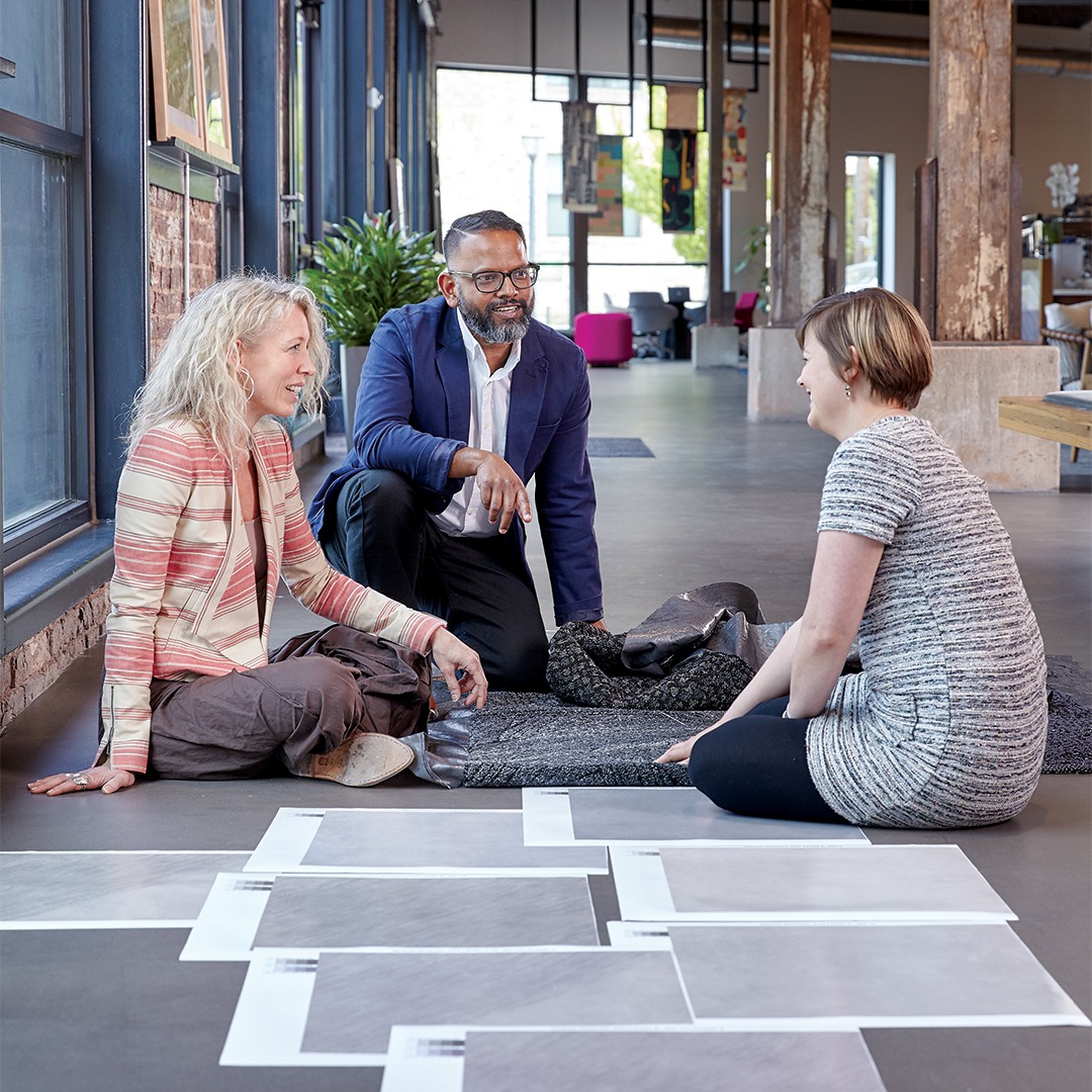
MIDDLE | Roby Isaac, Vice President of Commercial Design; RIGHT | Samantha Fletcher, Creative Manager; LEFT | Design Associate
Kathy Long:
Roby, can you walk us through how your design team finds inspiration for products?
Roby Isaac:
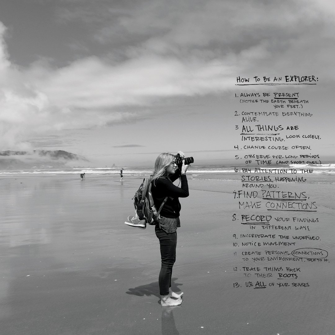
Our design process is multi-layered, but it all begins with having our designers placed in experience-based situations. The experiences, themselves, are varied & project-specific.
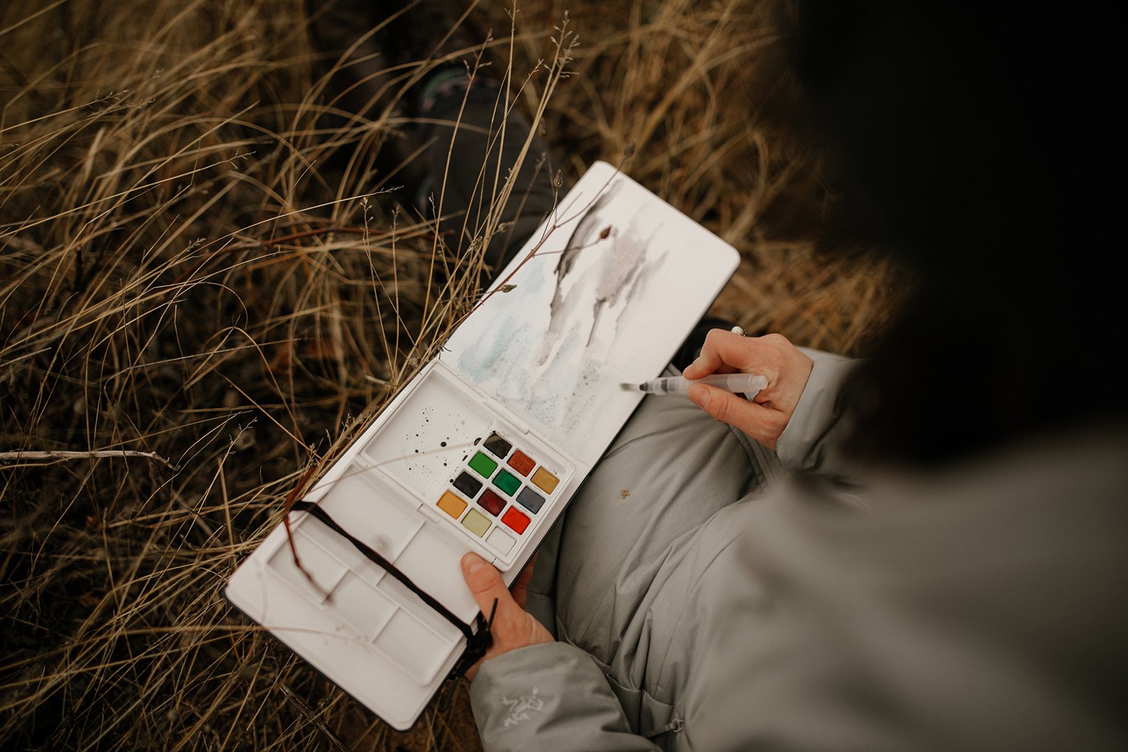
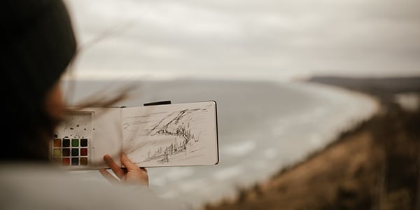
Sometimes it involves taking a trip to a destination to explore the surroundings; other times it may be conducting a material study in a studio environment. Whatever the “assignment” might be, the expectation is for the designer to immerse themselves into that situation and, then, artfully document their experience. Their recordings are centered around how they felt, what they saw, or any other way in which their senses were creatively stimulated.
Next, the designer is asked to turn their findings into visual studies. How this part is handled – which I like to refer to as the creative development phase - is up to the designer. Each person brings a special skill set to our studio & they are encouraged to use their creative backgrounds while developing their ideas.
Within our talented team, we have many that are trained in textile design; some have backgrounds in fine arts, interior design, graphic design, and illustration. It’s what builds the identity of our studio, and I want to celebrate it.
ABOVE | Alison Curran on a trip to Portland, OR ; for The Portland Project
KL:
Sam, when designers come back from an experience, each one has something from that experience they need to document and work toward translating into something that eventually becomes a product. What is that process and how do you encourage that translation into art or another form of expression on the path to a final concept?
Samantha Fletcher:
I think it’s important that we are transparent. Before we go on an exploration trip, the designers always have preconceived notions. It's natural human behavior to expect a certain thing but, once they get there and live in that moment, they discover things they didn't expect. When they come back, they’re filled with, "Wow! There was this and that. And I felt this way, or this happened." Their initial thoughts of where things were headed usually spin in a different direction.
They take that experience and make it visual, creating what feels most natural to them. That could be painting, or it could be textile art. Then we may challenge them to try other media, "All right, you've expressed it in paint, but how would you express it in three dimensions, or how would you express it in a medium you're not comfortable in?" This gets them to think outside of their comfort zone and keeps that exploration phase going.
In the beginning, it's less about trying to figure out a flooring product and more about staying interested in the discovery phase to work through the experience. That helps make sure they’re exploring all facets of what they saw, heard, and felt.
KL:
So you challenge them to do something outside their comfort zone. I've seen some of the paintings and loom work that you've done. What are some of the other types of art you've created as part of the process?
SF:
We've had designers build three-dimensional sculptures then photograph them at different angles. Busola did her weaving, but then she also created these three-dimensional objects using a balloon wrapped in yarn. That's not necessarily any sort of technique, but it was her way of playing with reality to create something different.
RI:
Sam’s 3D sculpture comment reminds me of the development of our Googie product. Our designer was asked to explore the idea of Googie architecture. One of the locations was in Southern California where there's a lot of existing architecture from that period that’s either been repurposed or is abandoned. While she was there, instead of just studying the lines of the architecture, she studied the activity that was happening around the buildings.
A lot of photography studies were done during different times of the day and at night. One of the coolest parts while reviewing the photos was seeing how the neon on the buildings came to life during the night hours. Through some initial research, we knew about the importance of neon on these buildings, but seeing how it made such an impact on these structures was really cool.
We reconsidered our original idea of only studying the architectural lines of the Googie style. Instead, we now wanted to include a study on how light played a part as well.
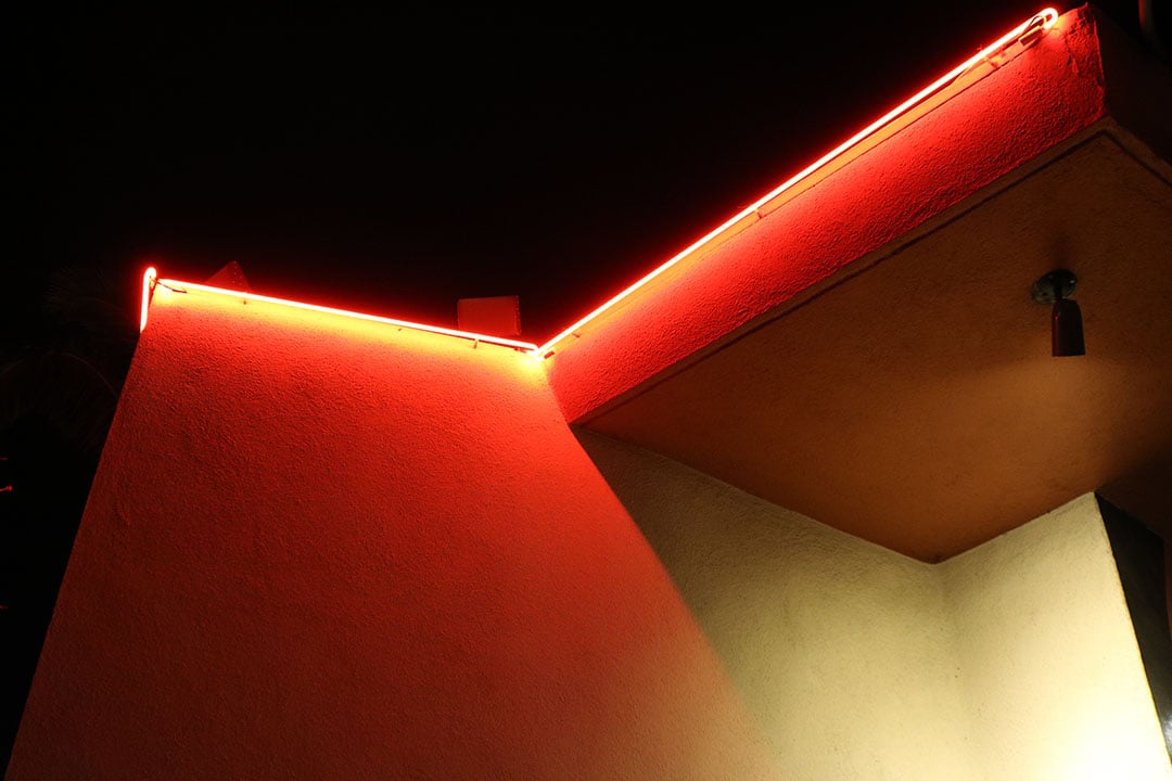
ABOVE | Photography property of Mannington Commercial; for the Googie Collection
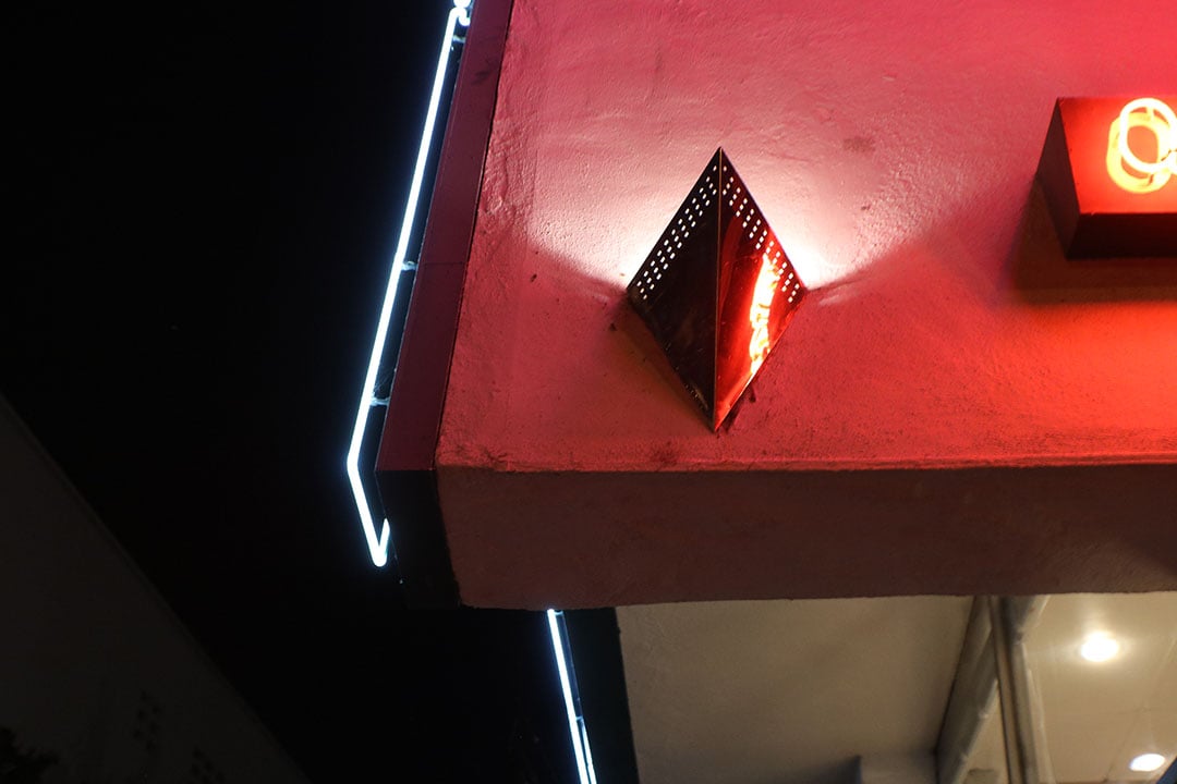
ABOVE | Photography property of Mannington Commercial; for the Googie Collection
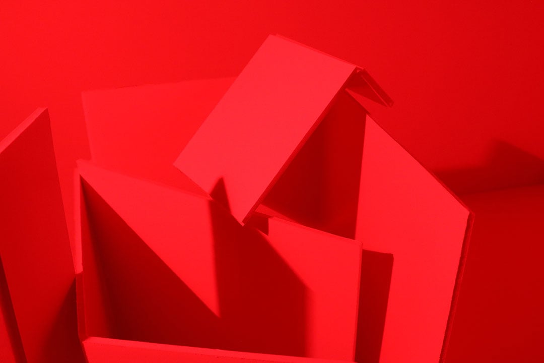
ABOVE | Small-scale model, representative of Googie Architecture
We ended up building small-scale models, representative of the building exteriors. When they were completed, they looked like small sculptural pieces. We attached lights to them to mimic how neon cast its light and shadow to the surfaces. Once the model was done, we were able to sketch pattern ideas and draw patterns that were influenced by our observations.
That exercise was a great example of beginning with a creative experience and ending up with an artistic object to use for inspiration.
KL:
Once you have these art forms, what do you do next to move the process along?
RI:
Throughout the creative development process, the designer is sharing items to look at. It could be anything from 2-dimensional sketches, pictures and concept boards to crafted pieces like weavings and mixed-material sculptures. We have a lot of conversation about what the pieces mean and how they relate to the original concepts.
ABOVE | Artwork by Mary Catherine Lowery; for Dark Skies
ABOVE | Artwork by Mary Catherine Lowery; for Dark Skies
These critiques, so to speak, are one of my favorite parts of the process. It’s open and abstract, and there’s no one “right” way of looking at things. We have these conversations until we define the goals on which the designer should focus. Sometimes that means refining the artwork more to connect to the concept more clearly; other times it means moving directly into digital development.
Our goal in having these critiques is to get to a place where the designer (and the entire product team) have the necessary content to develop products and craft the background stories.
KL:
That also helps them better express what they've seen and experienced so when they get to that design phase with the textiles, they really understand it and can create something with it. It’s interesting to know this isn't just a one-and-done thing; your department puts a lot of effort and thought into the designs and spends a lot of time making sure they’re developed from an experience.
How you take it from art to carpet?
RI:
After ideas are generated from the creative development phase, the designer will take time to create patterns on the computer. We also do critiques, or evaluations, of the digital patterns like the way we do with the artwork pieces. We identify things that we both like and don’t like within the pattern work & select what we’d like to see in prototype form.
Prototype development is similar, in that we review things to determine what works and what should move forward to the next step. All of this is a very iterative process that comes with a lot of exploration and discovery (of scale, texture, composition, construction, etc.).
Sometimes I joke that a little magic occurs somewhere in the middle of all this development. Even though it’s a bit tongue-in-cheek, I do believe that there are always moments where we thrive on the creative activity that’s happening around us. It’s hard to describe, or define, but it always happens… and it’s a critical part of our process.
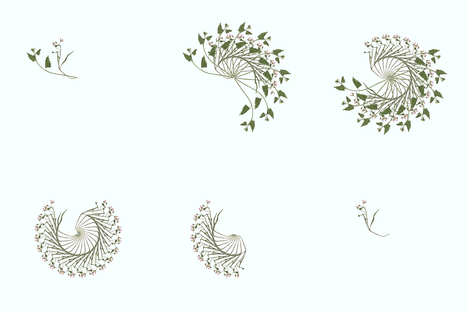
ABOVE | Scanned flowers digitally repeated to form a shape that was the inspiration behind the Bloom Collection.
SF:
A simple answer would be that sometimes the artwork is scanned then manipulated digitally. But it ends up being so much more than that! In short, after doing a lot of the artwork, you get it into the computer. From there, it switches from an exploration and discovery phase into "All right, you have a really good understanding of what it is that you explored, but now we need to get more tactical and decide how this becomes a product?" We start to categorize it. Is it a small-scale texture or a large bold pattern? What space is this going to live in? What other products will also live in this space? We try to figure out the different parts and pieces of the experience and how it translates into the actual product.
Designers have to put on a different hat to determine how we make this something that's tangible for the world and make people latch on to the product and be excited about it. And like Roby said, through this process it all starts to jive and come together like magic!
KL:
When you start the design process, you have parameters around the experience to work it into an education, workplace or healthcare product, etc. Is the challenge is to marry those parameters and the experience with the final outcome?
RI:
Absolutely. Typically there's a product brief that aligns with the experience. The designer is expected to bring back ideas and inspirations, but they have to be conscious of what it's going to be used for. A brief can be specific for a senior-living carpet collection, but they're not asked to bring back carpet ideas necessarily. When they return, they start the ideation process for how it moves into visuals that would work for carpet.
KL:
At some point you have to consider the performance features and balance that. When do you start thinking about those features and trying to make sure that the product hits the performance numbers that Mannington Commercial is well known for?
RI:
A lot of the parameters are outlined in the initial product brief, but they are definitely validated during the prototyping process. During the product adoption process, team meetings or any reviews we have, we remain mindful of the performance characteristics. Everything we’re developing has to align with market needs and business goals. As important as our vision is for design excellence, so is our commitment to great quality.
KL:
Let’s explore that digital process and talk about how we come up with prototypes and the technical process following the design experience.
Is the process different up to this point for carpet, LVT or sheet, or is it all the same up to a certain point? Are there differences in how you go through an experience and translate it into art and then into a product?
SF:
In terms of the experience and the creative development that the team does leading up to prototyping, the product category doesn't matter. Obviously, if they have the idea that they're doing carpet, LVT, sheet or rubber in the back of their minds, they may be inclined to do certain explorations.
We try to keep it open and always try to challenge the designers. When they first start, they're in a creative bubble, and their goal is to just create. Then once they get past a certain point, we get them back into the real world. And it’s important to note, not all of their exploratory work gets translated into product; some of that work will forever live in the creative bubble.
KL:
Is the coloring that goes along with the different styles part of the experience or does that come in later when you're starting the prototype?
SF:
I'd say it's a melding. We have the brief, and we know the market segment so that helps us create some clear color boundaries. A K-12 collection will be colored in a more specific way than a senior-living collection. But we also keep the original experience in mind. And in many instances, color is an easier way to translate emotion. A lot of times, we end up going back to the experience when we start to evaluate colors and pare them down for the final selection because there's that emotive piece of the experience that helps us make better decisions.
RI:
Sometimes the experience, or research trip, that the designers have will yield a lot of great content for color studies. One example that comes to mind is when Alison went to La Jolla and visited The Salk Institute. She came back and did a material study on concrete. When one thinks of concrete it often has a perception of being a ‘cold’ material. The mood boards that Alison boards created, however, spoke to the warmth of the material that she felt in the actual space; and the colors represented on the boards reflected that. We paired this study and information with what we were seeing in total market trends and segment-specific trends.
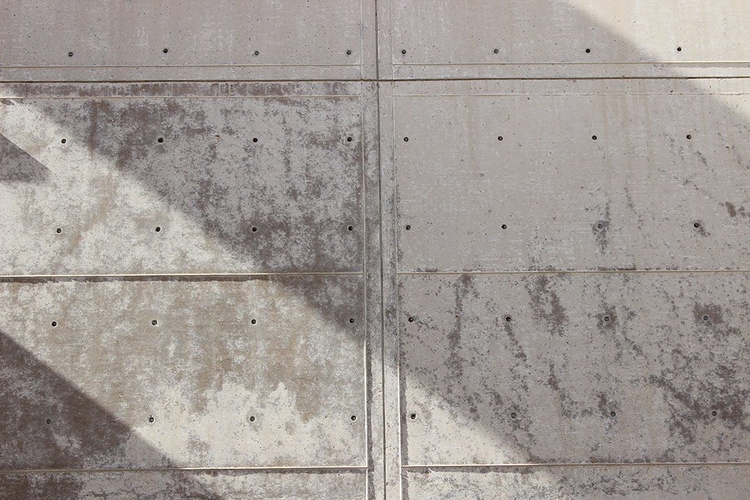
ABOVE | The Salk Institute Photographed by Alison Curran
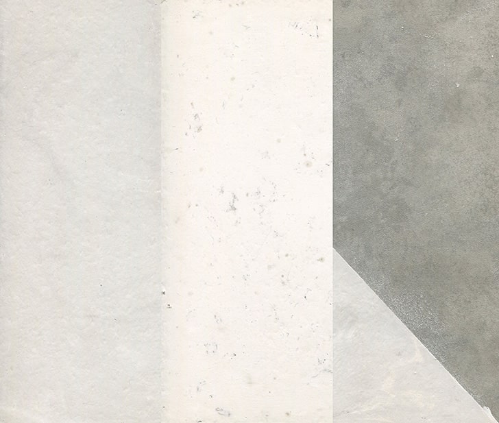
ABOVE | artwork by Alison Curran; for Mixed Monolith
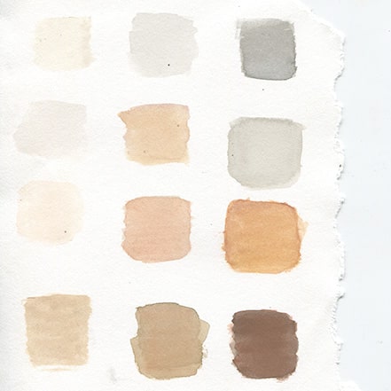
ABOVE | artwork by Alison Curran
KL:
Is there anything else about the design process up to the prototype stage that you want to share?
SF:
It’s really fun! It's not a marketing tactic to make our customers think that we're having fun at Mannington Commercial, traveling and doing hands-on creative work. We have a really talented team of designers who at their core love to explore and create, which makes this part of the design process feel more like play then work.
RI:
Sam said something earlier that I think is key...the design bubble. That idea is an extremely important piece of the puzzle. Far too often, specifically in the commercial products industry, a lot of emphasis will be put on getting products launched and into the market. So much has to happen in a sequential and orderly way. It’s a very linear process. It needs to be.
But, when we’re in our “design-bubble space”, we're okay with it not being linear. It’s more of a squiggle that works itself out. And we’re okay with that.
There is an openness to discovering things throughout the process. We’re okay when things don’t work out on the first try, because a better option might turn up the second version. We’re pleased when happy accidents surprise us. And I’m not sure that could exist in many other spaces in our organization; where you're allowed to play - and sometimes stumble a little - before finding that “aha!”moment.
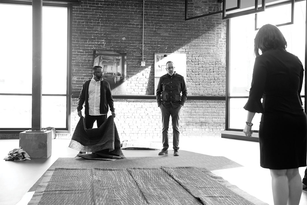
ABOVE | Roby Isaac and Artist, Gabriel Dawe; for The Moire Collection
The reality is that after we leave that bubble, there's like 75 percent of this process that's very linear, very much structured, with spreadsheets and databases. So we fully embrace the time that we’re in that bubble.
As you can see, the journey from inspiration to final product design is creatively complex, filled with both established processes and artistic vision. The Mannington Commercial design team is uniquely positioned to work through the spectrum of discovery, inspiration and design to help create an unparalleled collection of flooring products. To see the results of their efforts, log on to the Mannington Commercial site and peruse the myriad collections then contact a sales rep for samples.
Download the first issue of our new design look book, you’ll find ideas on how to use an array of flooring styles to craft your environments
