We’re all getting a little more comfortable with being instructed on where to stand or which direction we should be walking, whether that be tape on the floor or a hand crafted sign at the door of our favorite small business, gently reminding us to wear a mask.
COVID-19 has changed the way we interact with our places of work and socialization, and the importance of maintaining social distance. No one is exactly sure what the future will look like, but directional signage is here to stay. Clients are looking for creative and easy ways to incorporate more guidance to a visitor into their design plans. How exactly do we do this? Through wayfinding.
What are the universal cues that we can easily follow? Maybe you have started to notice how you are assessing spaces, looking for wayfinding signage to help you navigate through them. In this article we will touch on the importance of wayfinding and how it can be used beyond COVID-19 to have an impact on the design and ease of use in our everyday environments.
For the interior designers, interior architects, and facility managers, this pandemic has unearthed huge challenges that we believe design can solve or at least aid in. As a flooring manufacturer, we are diving into finding ways the floor can offer safety in the form of flooring guides to help you find your way around a space, or better said, wayfinding.

What is Wayfinding?
Wayfinding is an information system that helps guide people through a space. When wayfinding is successful it should help people better understand and experience environments.
Typically wayfinding is most important in complex spaces like transportation centers, healthcare settings, and large education campuses. In these complex and sometimes high-stress environments, wayfinding helps people to feel safe and secure navigating to their destinations.
However, this year, when the pandemic hit the US, wayfinding found its place into all of our everyday environments from the grocery store to the bank. Traditionally we relied on our social norms in these types of environments to know where to go and how to proceed through a space, but that has changed.
Navigating these spaces in a safe way that allows us to properly social distance has become paramount and required us to process new information and direction for how to move through these spaces. A few common examples would be arrows in the aisles of big box stores, dots for the grocery store checkout line, etc.
Wayfinding in Everyday Life
There are several ways in which our human brains innately understand wayfinding cues, comprehending the visuals unconsciously before our conscious minds realize it. This is meant to help eliminate any confusion or anxiety.
For example, in cities you will see signs for pedestrians as well as motorists. While the signs are helping them to navigate the same environment, they are doing so in very different ways. In both instances however the goal is to get people to develop mental maps of the city.
Sometimes mental maps are not the most effective way. In hospitals for example, it can be high stress and you are rushing to get to the right location to visit your loved ones. It can be very difficult to convey a lot of different information for different needs in a clean and digestible way. Here we will see information being shared with colors and symbols, eliminating the use of text.
And lastly you have wayfinding that needs to take you on a full journey, navigating you through several spaces like in an airport- going from roadway to terminal all the way to the airplane. In these types of environments it is carefully planned, sequential information that takes you through step by step.
Designing for Distance
Designing for distance and flexibility has become key during these times. People will increasingly want to control how much they opt in or out of human interaction.
A Los Angeles–based multidisciplinary design firm RIOS, is welcoming back workers, encouraging social distancing while also maintaining an uplifting atmosphere. They have added temperature checks and individual lockers for each employee to safely store their belongings.
Many employees are still encouraged to work from home, but should you choose to come into the office you can reserve a desk ahead of time. To make sure everyone feels connected to those in the office new technology has been integrated for virtual participants.
Changes are continuing to happen in retail spaces as well. Not only are you designing for distance incorporating wayfinding to help the flow of people through spaces, but we are also seeing a big technology push here as well. “Consumers will opt for unmanned and autonomous in store services, from self service Kiosks to digital ordering, as heightened fear of prolonged human contact fuels digital innovation.” WGSN
With only one-third of American adults saying they will feel safe shopping after stores reopen, messaging and signage must be reassuring and instructive to allay people's fears, while interior design should be safe and calming, echoing the comfort of consumers' own homes. In an effort to avoid crowded stores, customers have been using more pick up and delivery options. These options existed before the pandemic but have had to scale up significantly.
For those who are shopping instores, retailers have been working on apps that can help improve in store experiences. Some retailers, like Home Depot, have apps that now incorporate wayfinding features.
Instead of asking an employee where you can find a product, you simply search it on the app and it will give you step by step directions to navigate you to its location. The use of this feature has increased by 5 times since March. " Even when the pandemic does subside, the leap to new technologies will have staying power and be a strong part of the future of retail, Kohan says. “It doesn’t have to be an app or necessarily driven by technology,” she says. “There are many ways to support navigation in the store. The future offers us a new opportunity.”
Signage:
We’ve discussed how we are seeing more wayfinding signage around us, now let's discuss things to consider when incorporating new wayfinding signage into your spaces.
1. Use your signs to communicate in a way that is friendly
COVID-19 is a very serious health issue, but that doesn’t mean we need to scare people into taking the necessary precautions. You can use your signs to communicate in a friendly way that can help provide some levity to the day for people.
San Francisco based studio O+A has been doing just that! They recently completed a project, Signs of the Times, where some of their graphic artists were asked to develop a series of posters that offered friendly and amusing reminders. For example, rather than saying “Masks Required!” O+A’s signs say, “Chin up! (But Keep it Covered.)”
Orpilla believes that people are thrilled to be able to get back to the office and that it should be a joyful experience. “Our signage reflects that,” he says, “and we expect this spirit to prevail beyond COVID-19. One thing a life-changing ordeal always does is make you appreciate new what you took for granted. O+A is rethinking workplace design in the context of people happy being together again.”
2. Importance of color choices
Along with conveying a friendly message with your word choices, you can also set the tone through color choices. There are a few things to keep in mind when it comes to color:
As companies begin to integrate wayfinding signage into their spaces, keeping graphic design treatments in mind, they can do it in a way that connects to their existing branding guidelines. By doing so the visuals and colors of the signage will weave themselves into the spaces seamlessly, and companies can continue to express their personalities to their employees and customers like they always have.
And last color plays a key role in the emotional aspects of a space. As we move into 2021 and beyond, I suspect we will see spaces taking on a hygienic feeling, making indoor spaces feel safe for us to spend time in. This emphasis on cleanliness will be translated through spa like colors, and more earthy palettes we have typically seen in healthcare. These colors have been known to instill a sense of calm and could be a benefit when sharing important information to people about wayfinding in a calm way.
3. Location options
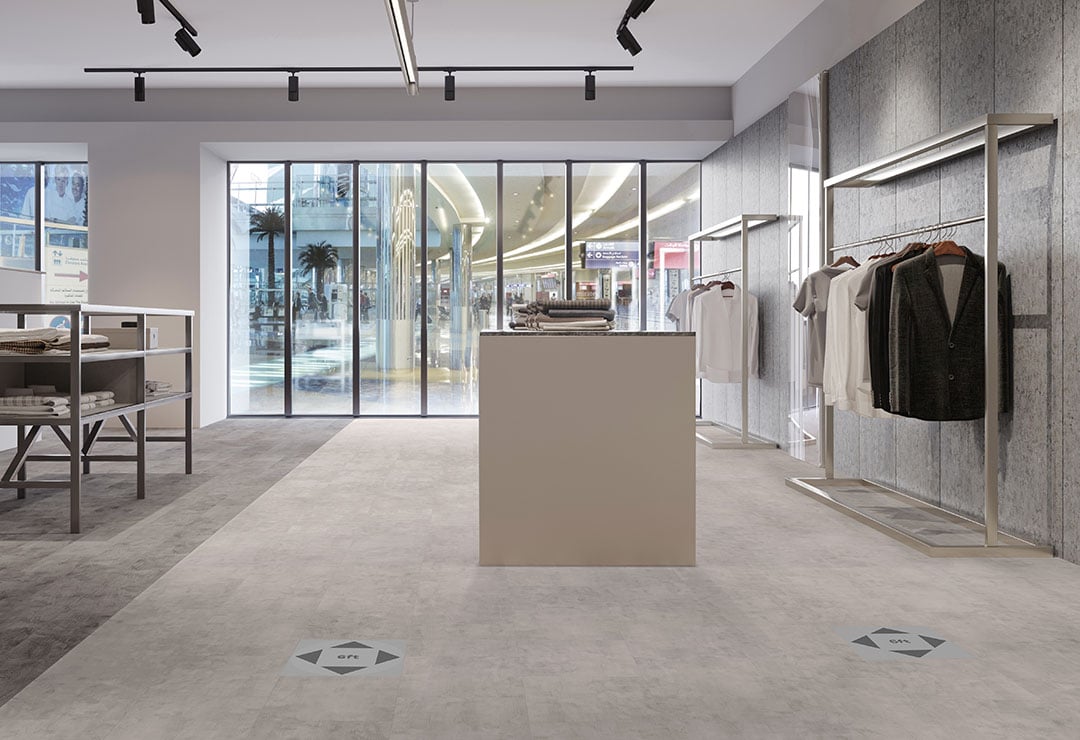
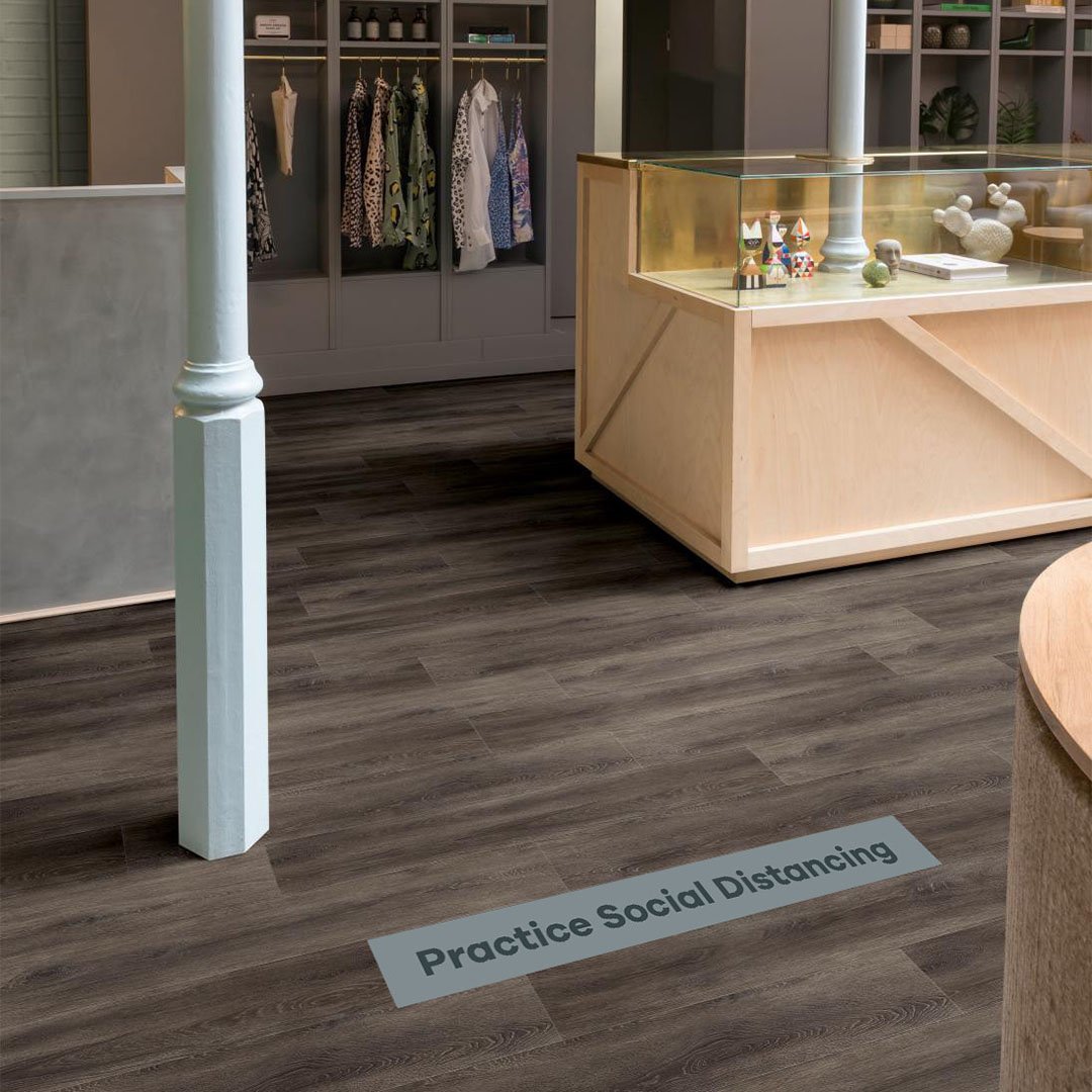
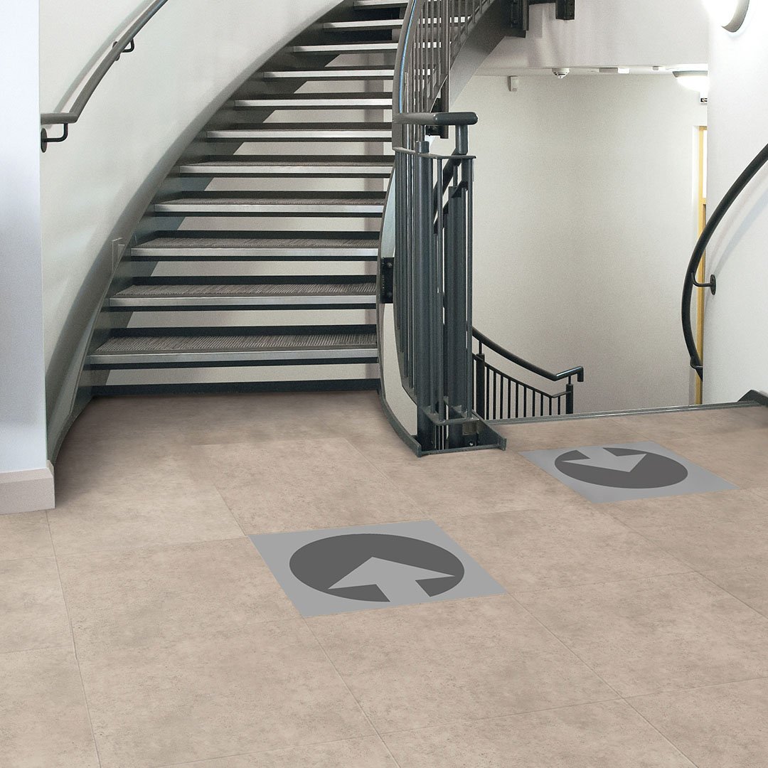
Wayfinding signage can be integrated into both walls and floors. We have all seen the world adapt to these changes with vinyl floor decals appearing in all public spaces practically overnight! Arrows have been installed in grocery stores to help direct the flow of traffic. And I have also seen signage used on the floor to help patrons maintain their 6 foot distance while waiting in checkout lines.
As a flooring company we couldn’t help but wonder, how could we support wayfinding solutions now and into the future. With our incredible customization options we can help take wayfinding from sketch to reality and feel seamless in your design.
While the vinyl decals are convenient and easy to install, they are not a long lasting solution, often shown to become damaged and peel up in a short period of time. We are excited to offer an alternative solution that can be incorporated into existing floors or in new installations.
There is a great deal of time and money spent on flooring for any project. Don’t compromise your beautiful installation. Our new Wayfinding LVT solution allows you to incorporate your wayfinding messages or directions into your Luxury Vinyl Floor seamlessly and it will hold up over time, just like the rest of your LVT floor.
So, how does it work?
We utilize our domestic LVT manufacturing and our investment in digital print to allow you to create customized wayfinding pieces of LVT that fit into your existing design. With no minimum and standard lead times, this can be ordered with your other flooring or all on its own.
Get started in a few simple steps:
- Choose from our pre-selected size offerings
- Choose your message from our curated offering or develop your own
- Choose your 2 Pantone colors for background / foreground coloring
- Place your order for as many as you need - no minimum!
Not seeing the right message or want more colors? No problem, we have a fully customizable version option available as well.
This solution offers the full benefits of high performance LVT with the customization and flexibility of a vinyl sticker. These wayfinding LVT pieces will add that extra special design element to your LVT floor and will help give those in the space the needed wayfinding clues they are looking for. Contact your Mannington Rep to learn more or to get a sample.
Looking Ahead
Wayfinding existed before this pandemic and will continue to exist after, but much like other aspects of design and life, this pandemic is causing all of us to move forward with increased intention.
COVID-19 has allowed us all to take pause and reassess how we can best communicate navigation throughout spaces. When wayfinding design is approached with the purpose of people in mind: it should be easy to understand and accessible to all, friendly and fun when appropriate, connect to existing branding guidelines, and seamlessly integrate into the physical space.
Are you a Designer or Architect specifying flooring for hospitals and healthcare spaces?
We have a guide for you! This guide gives an overview of the products commonly used in healthcare projects, as well as how to specify, install and maintain them.
Get your complete guide to Healthcare Flooring 👇


