
Have you ever noticed how color and pattern in a space can affect your mood?
Color is a sensory perception that can drive our emotions. Blues and greens create a sense of calm, while reds and yellows tend to be more energizing. However, within each color family, there needs to be a balance: warm tones can evoke a rich inviting feel, but lean too far and a space can look dirty and aged. In the same way, blues can feel peaceful and clean, or cold and clinical.
Mannington design pros have compiled product palettes that are carefully curated to help designers and specifiers create their desired environment. In this article, we will look at colors and patterns used in Healthcare.
In Healthcare specifically, finding this perfect color balance and blend is crucial. It is important for patients to feel comfortable and calm, but cleanliness and hygiene is the top priority. No patient would feel safe in a seemingly dirty hospital room, but a cold and sterile atmosphere can be detrimental for a patient’s mental and emotional health, especially those long term patients.

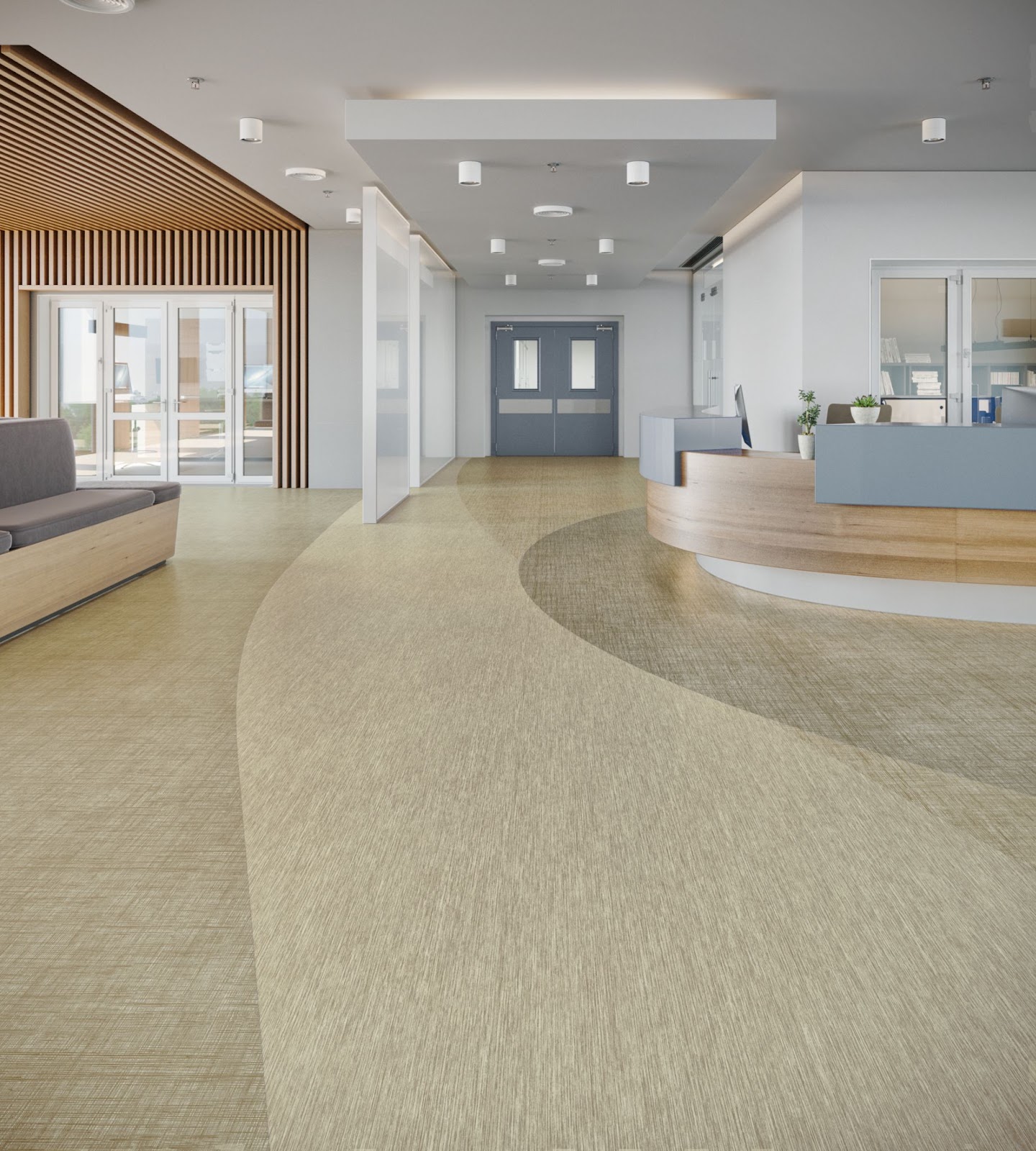
In this palette, we see a blend of pattern and colors. The blue and green Bloom products have a soft quality, with organic motifs and textures blending together to move the eye calmly through the space. Low contrast amongst the pattern gives the product a quiet feel. Warm woods can add another layer of comfort - reminders of more residential styled products and environments.
A design trick for keeping warm products from looking dirty, is to choose a warm product that has undercurrents of greys, to soften the richness of the warm and keep them from looking prematurely aged.
Discovery Collection, Encounter - Destiny
In a similar way, healthcare cool products often read as blues or greys in a space, but often have a warm base to keep the tone comforting and inviting, and to avoid leaning overly clinical and sterile. Partnering a cool product next to a warm colored product can also help give a space both a comforting yet clean feel.
"We are seeing a shift in healthcare where it is taking on more of a hospitality and residential type of look and feel. This new direction focuses on creating spaces that welcome people as if they were special guests and not just patients. The color and pattern choices can really create this overall sense of calm and support healing. With this change we will see more sophisticated approaches to neutrals, striking that balance between warm and cool. Patterning will also be subtle and reflect natural materials or other nature references."- Samantha Fletcher, Creative Manager
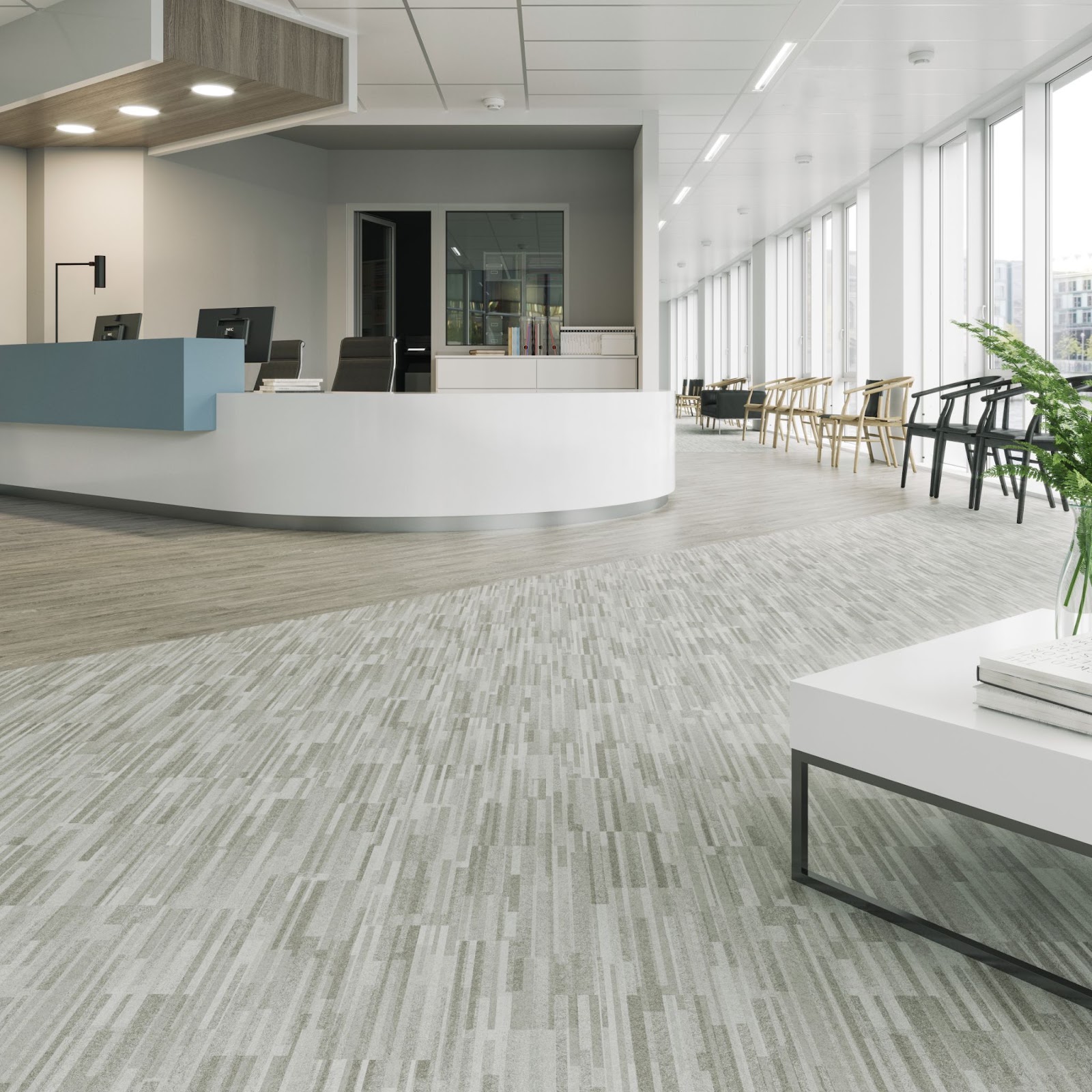
Healthcare products are designed with patterns intended to hide wear and scuff marks from constant traffic - not only from the large influx of patients but also from heavy hospital equipment. To help in the longevity of the products visual appearance, smaller textures are often built into the patterns of healthcare products.
Related: What is Biophilic Design in Commercial Healthcare Settings?
Denver-based Gallun Snow has specialized in designing spaces for healthcare since 1988. Sara Parsons, principal, and Melyssa Feiler, associate, at Gallun Snow talked with us about the process behind their project with UCHealth Poudre Valley Hospital in Fort Collins, Colorado.
Download a free copy of the full case study. 👇